In the field of data science, data visualising is undoubtedly one of the top words today. No matter what kind of data you want to analyze, doing data visualization is usually a necessary step. But there are many people that don’t have a specific concept of data visualization, and they don’t know how to implement it.
Data visualization is the use of human natural skills to improve data processing and organization efficiency. Visualization can help us deal with more complex information and improve memory. Most people don’t know much about statistical data or basic statistical methods (mean, median, range, etc.) and are not in line with human cognitive nature. For some people it is difficult to see the law according to statistical methods, but it is very clear when the data is visualized.
Technically, the simplest understanding of data visualization is the mapping from data space to graphic space. A classic visual implementation procedure is to process and filter the data, transform it into an expressible visual form and then change it into a user-visible view. (1)
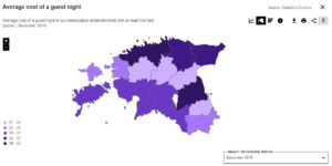
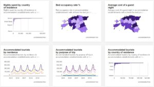
For visual example Statistics Estonia has taken into use dashboards (https://juhtimislauad.stat.ee/). At the moment there are only few domains (Business, Local Government and Central government) with sub-domains, but with sub-domains there comes many visualized dashboards. For example, under sub-domain of Tourism there is a lot of different graphs. They are visualized with best match from distinct graphs, which are changeable and when moving mouse on the data we get more precise data. There is also information about the description definitions and notes to consider when analysing the graphs.
The graph can be zoomed in/out and there is also changeable reference period, by default is the latest period in database.
Data visualising is one of BerryBI’s expertise as well!
(1) – https://towardsdatascience.com/9-data-visualization-tools-that-you-cannot-miss-in-2019-3ff23222a927